Imagine this scenario: Your paid Meta ad campaign is optimized flawlessly. Your targeting is broad, your unique click identifier tracking is locked down, and your cost-per-click is remarkably low. Thousands of local users are actively clicking your ad, eager to claim your irresistible promotional offer.
They click the link, expecting a fast, seamless transition. Instead, they are redirected to your main company website homepage. The page layout takes six full seconds to load. When it finally opens, the user is greeted by a chaotic corporate menu, a giant block of text about your founding history in 2012, three unrelated blog links, and a tiny, hidden “Contact Us” form buried at the very bottom of the footer.
The user feels overwhelmed, loses patience, hits the back button, and disappears forever. You check your tracking panel at the end of the day: 500 outbound link clicks, but exactly two form submissions. Your hard-earned ad budget didn’t just leak—it completely evaporated.
Naturally, frustration sets in. You start wondering, “Why is my traffic bouncing so quickly? Is my ad offer not attractive enough? Do I need to redesign my entire brand color palette just to get people to drop their email and phone number?”
First of all, take a deep breath. At Anus Khan Insights, we want to reassure you that this massive drop-off does not mean your audience is low-quality, nor does it mean your paid ads are broken. It simply means you are violating the fundamental law of digital conversion: Attention is a finite resource. When you send targeted ad traffic to a generic corporate homepage with dozens of navigation options, you are forcing the user to do homework.
In this comprehensive, step-by-step masterclass, we will pull back the curtain on high-performance landing page architecture. We will analyze why traditional multi-page layouts destroy paid traffic ROI and show you the exact free layout structures to build high-converting landing pages that convert casual clicks into a massive volume of predictable leads.
Let’s optimize your digital storefront together!
The Golden Rule: The Single-Purpose Tunnel vs. The Distraction Amusement Park
Before you open Elementor, WordPress, or any web development page builder, you must understand the psychological objective of a dedicated landing page asset. A standard website homepage is designed for exploration; a premium landing page is designed strictly for conversion.
To understand this effortlessly, let’s bring back our favorite Highway Toll Booth Analogy.
Think of a standard corporate homepage as a massive city highway interchange. There are exits for the company blog, an “About Us” page, social media icons, and employee profiles. It is a distraction amusement park where traffic scatters in every direction.
Conversely, think of a high-converting landing page as a secure, walled Highway Toll Booth.
Drivers enter the lane with high momentum. There are no side exits, no scenic detours, and no reverse turns. There are only two possible outcomes: either they pay the toll by filling out the lead capture form, or they completely shut down their car and leave the highway (closing the tab).
If your landing page features a top header navigation menu containing five different links, you have intentionally built holes into your toll booth. Your primary goal as a professional digital strategist is to strip away every ounce of cognitive friction, guiding the consumer’s eye down a single-lane tunnel toward a clear call to action.
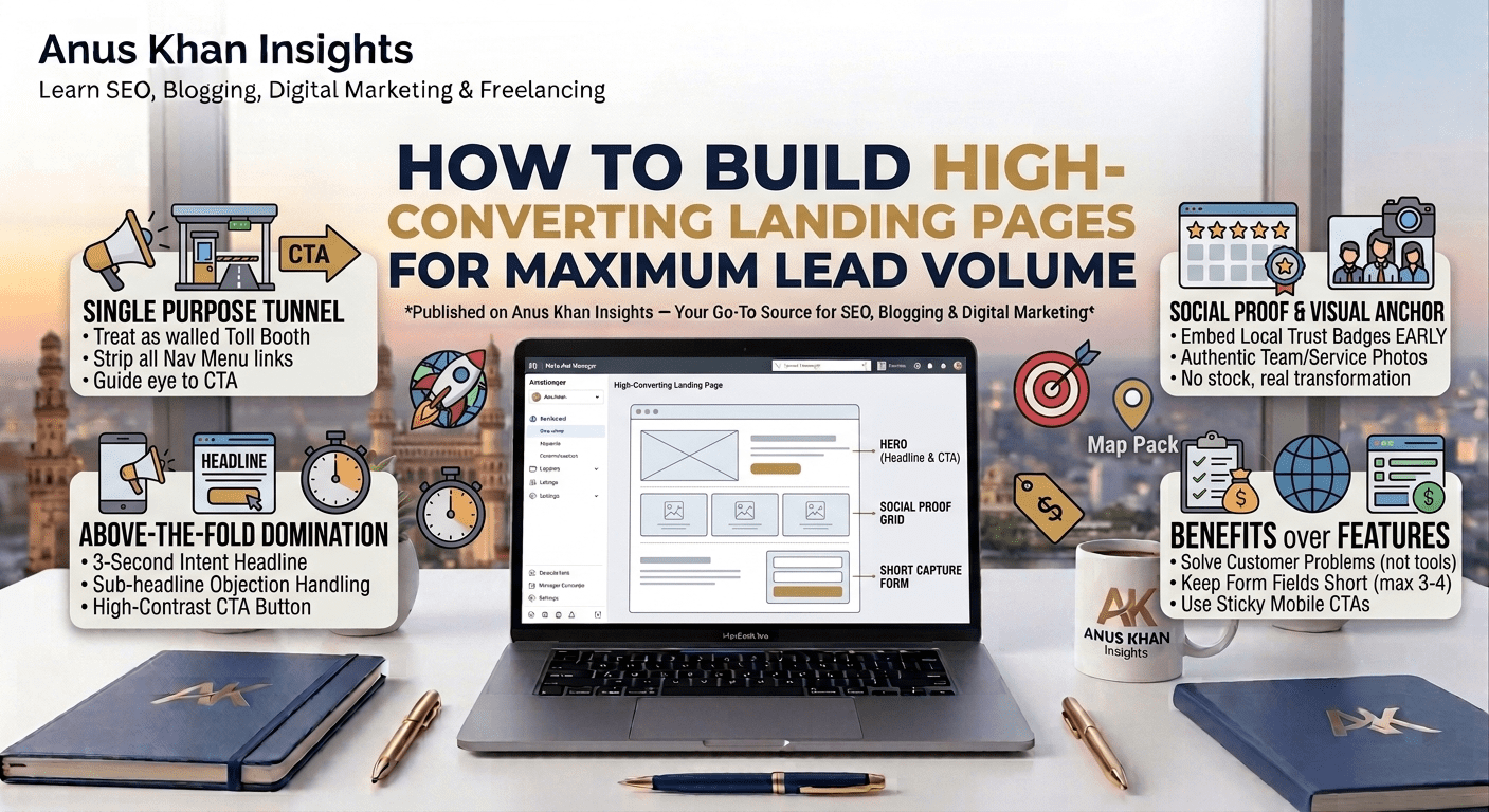
5 Core Pillars of a High-Converting Landing Page Layout
If your web pages are suffering from high bounce rates and low submission volume, reconstruct your single-page layout utilizing this exact structural wireframe sequence from top to bottom:
1. The Above-The-Fold Domination (Hero Section)
The “Above-the-Fold” area is the exact layout space a user sees on their mobile phone or desktop screen before they scroll down even a single millimeter. If this section fails to articulate your value proposition within three seconds, the user leaves.
The Framework: Your hero section must contain three key elements:
An Intent-Driven Headline: State exactly what benefit the customer receives, featuring your primary keyword. (e.g., “Get Your AC Restored Today With Our $49 Pre-Summer Safety Audit”)
A Clear Sub-headline: Explain briefly how you deliver that promise while handling their biggest objection. (e.g., “Same-day diagnostic service across Hyderabad with zero hidden fees.”)
A High-Contrast CTA Button: A bright, contrasting button that sticks out instantly. Use action-oriented text like “Claim Your $49 Voucher Now” instead of generic words like “Submit”.
2. Immediate Social Proof Integration
Never make a prospect scroll through your entire page layout before proving that your business is highly trustworthy.
The Blueprint: Directly underneath your primary Hero CTA button, embed a compact social proof banner. Display a clean 5-star badge grid alongside a localized authority statement, such as “Trusted by over 1,400+ homeowners in Hyderabad.” This instantly satisfies the algorithm’s prominence expectations and calms consumer skepticism early.
3. The Visual Transformation Anchor
Avoid using generic, low-quality internet stock photos showing actors wearing crisp, hard hats or fake smiles. Stock imagery signals unoriginality and kills your conversion percentages.
The Action Step: Feature high-resolution, authentic imagery or a short 60-second video demonstrating the real-world transformation your service provides. For an interior designer, show a clean side-by-side Before/After slider layout. For a local service provider, show a smiling photo of your real team standing proudly in front of a branded company vehicle.
4. Bulletproof Benefits over Technical Features
When summarizing your service offerings, don’t write long, exhausting paragraphs detailing your technical tools or operational equipment.
The Strategy: Break your presentation down into a clean grid of three to four bullet points. Dedicate each point to a specific, high-intent consumer problem. Instead of listing “We use 256-bit automated encryption software,” reframe it as a customer benefit: “100% Secure Data Vault Protection — Your personal details are locked down and never shared with third parties.”
5. Short-Form Capture with Sticky Accessibility
Every extra form field you add to your contact layout drops your conversion rate by a measurable margin. If you don’t absolutely need their home address, fax number, and company size just to schedule an introductory call, remove those input blocks immediately.
The Setup: Limit your primary form capture fields strictly to three high-intent variables: First Name, Direct Mobile Number, and Primary Email. Implement a “Sticky Call to Action” button on mobile devices so that as the user scrolls down the page reading your testimonials, a clear conversion link remains anchored seamlessly at the bottom of their screen.
Landing Page Conversion & Performance Quick-Reference Table
| Performance Symptom | What It Truly Means | How to Fix It Fast |
| High Mobile Traffic, Low Form Conversion | Your page layout looks fantastic on a desktop monitor, but scales poorly or displays text too small on mobile screens. | Run a mobile responsive audit; enlarge your form inputs and place your main call-to-action button dead-center on mobile screens. |
| Excellent CTR, but High Page Bounce Rate | There is an explicit disconnect between what your ad creative promised and what your landing page layout displays. | Match your headers verbatim. If your ad says “Free Smile Consultation,” your landing page headline must say “Free Smile Consultation”. |
| Slow Mobile Load Speeds (Over 4 Seconds) | Your page is weighed down by massive, uncompressed images or bloated external script codes. | Run your URL through Google PageSpeed Insights; compress all images into .webp formatting and delay unneeded tracking scripts. |
| Users start filling forms but quit midway. | Your form layout is asking for highly sensitive or complex information too early in the consumer journey. | Turn your lengthy questionnaire into a multi-step form layout, utilizing a low-friction progress bar to build user momentum. |
Final Thoughts
At the end of the day, maximizing your local lead volume isn’t about building the most visually artistic web canvas on the internet—it’s about building an uninterrupted path of least resistance. When you eliminate distracting links, structure your headlines around real human problems, and make the submission process completely effortless, your conversion rates will climb naturally.
Let’s do a quick recap of our diagnostic action plan:
Treat your landing page layout as a single-purpose tunnel; eliminate top navigation menu links
Hook consumer attention within three seconds by placing an irresistible headline above the fold.
Display explicit local social proof badges right below your primary hero section to lock in trust immediately.
Swap out generic corporate stock photos for authentic imagery showing your real team and services.
Keep your form fields short and utilize sticky buttons to make conversion accessible at any stage of scrolling.
At Anus Khan Insights, we are dedicated to simplifying the technical side of web growth. Structure your pages cleanly, map your user intent systematically, and watch your business lead volume and campaign ROI scale!
Written by Muhammad Anus Khan — Digital Strategist, SEO Expert & Founder of Anus Khan Insights
Category: Landing Page Optimization & Conversion | Reading Time: 8 Minutes | Level: Intermediate
Next Read: How to A/B Test Landing Page Elements to Double Conversion Rates Safely — Coming Tomorrow on Anus Khan Insights!
Leave a Reply